Highlights
- In the report’s models that adjust for age and sex, kids in married parent families have lower mortality than kids in any other type of family configuration. Post This
- Deaths of young people are quite a bit higher in the U.S. than they are in other developed countries. Post This
- Perhaps it’s best not to see mortality as a single problem at all, but rather a manifestation of many separate issues in American society that we must confront. Post This
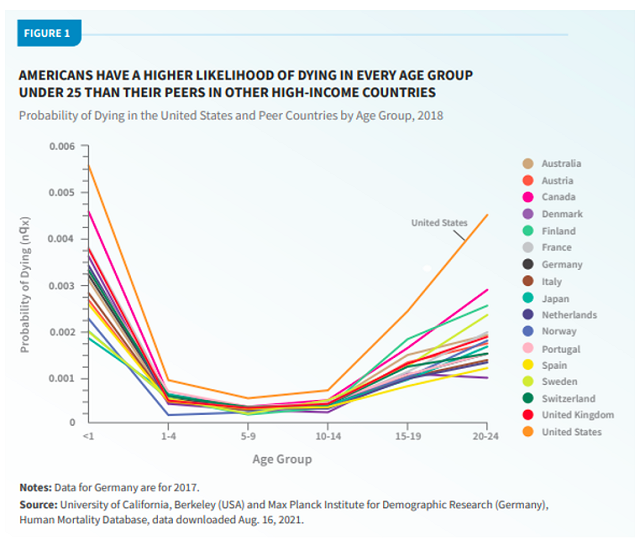
When we think about death, we normally think about the elderly, or at least the aging. But the deaths of the young, while rare, are particularly tragic. As a new Population Bulletin (from the Population Reference Bureau, or PRB) shows, these deaths are quite a bit higher in the U.S. than they are in other developed countries.
This chart from the report summarizes the overall picture. Note that the Y axis depicts the chance of dying at any point during the age range in question—so infant mortality is the chance of dying in one year, while the other bins are the chance of dying in four or five years. In any one of these countries, then, infancy is by far the riskiest time to be alive.
Here are some more takeaways from the report, with additional analysis based on publicly available CDC data and other sources. For each topic there are two main questions: Does a given variable help to explain mortality patterns within the U.S.? And is it a plausible explanation for the international gaps above?
1. A big part of the story is about race, with a supporting role for region.
As the report details, black Americans and those living in the South have much higher mortality rates. We can dig into this a little with the CDC data. Here are the annual death rates for Americans in each racial group:
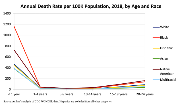
The gap is striking. Some racial groups within the U.S., including whites, Hispanics, and Asians, have mortality rates that aren’t too far off from the international norm, while blacks and Native Americans have rates much higher than the already-high national average.1
Socioeconomic status seems to explain at least some of the racial gap within the U.S., per some modeling discussed in the PRB report.2 Blacks have 60% higher mortality than whites in a model that adjusts only for age and sex (using a different data set from the one above). But when socioeconomic variables are added, the gap falls to 19%—though this is statistically insignificant, meaning the confidence interval is wide enough to include zero, and thus to include numbers far above 19% as well.
The regional gap is slightly less dramatic, but when combined with the racial gap, it further clarifies which groups of Americans are driving the higher mortality risk. For both infants and young adults, for example, non-Hispanic whites living in the Northeast and West have about one-fifth lower mortality rates than those living in the South, per the public CDC data.
America’s racial history and regional subcultures are unique, so some of the international gap may come from the fact that we confront historical and cultural obstacles that other rich countries do not. Of course, that does not get us out of actually confronting them.
2. Family structure might have a role, too.
In the report’s models that adjust for age and sex, kids in married two-parent families have lower mortality than kids in any other type of family configuration. Kids with cohabiting or stepparents have about one-third higher risk; kids with single moms, one-half higher; kids with single dads, two-thirds higher. And family structure plays out a bit differently in the U.S. from how it does in other countries. For example, American kids tend to experience a lot more of their parents’ transitions to new partners.
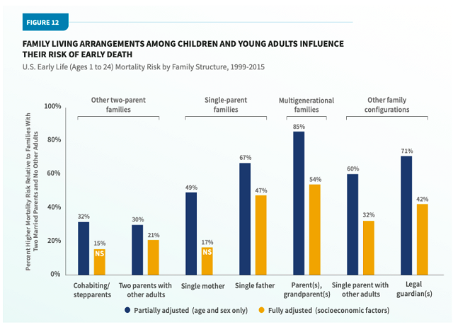
Going deeper into the correlation between family structure and mortality, though, is a statistical minefield. For example, as it does for race, the PRB report features modeling that controls for socioeconomic factors including household income, in which the family-structure gaps shrink and sometimes become statistically insignificant. However, two-parent families have more income, in part, because they have two adults who can work, so income is not truly a separate variable from family structure.
Additionally, different types of people tend to form different types of families in ways not fully captured by socioeconomic measures—so with these data, it’s hard to say how much of any gap stems from family structure itself, and how much from, say, the personalities and other traits of the folks who tend to become single vs. married parents.
3. Dysfunctional behavior is a big death driver for older age groups.
Here’s how young people tend to die, from the PRB report. Once the teen and young-adult years hit, the culprits are often human action rather than health problems.
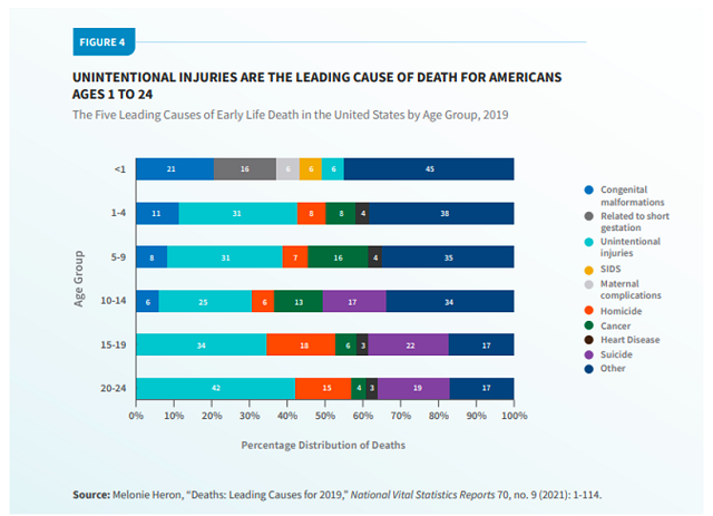
The CDC data allow us to break down “unintentional injuries” for 20-24-year-olds a bit. This is overwhelmingly just two things: About 45% car accidents, and about 45% poisonings (which are nearly synonymous with drug overdoses). Therefore, homicide, suicide, and drug overdoses account for about half of all the deaths in this age group, and while the U.S. suicide rate is not much of an international outlier, its homicide rate and drug epidemic are unparalleled in other rich nations. Car-crash deaths, while not always resulting from recklessness, are also especially common in the U.S.
4. Poor kids do have higher mortality, unsurprisingly, but the “child poverty” explanation for international gaps is trickier than one might think.
The new report claims that “the U.S. child poverty rate was the second highest out of 35 advanced economies, lower than only Romania,” and it pushes for more government spending on families, such as expanded tax credits. In an op-ed promoting the study, a coauthor reiterates these points.
But there’s a big caveat to the poverty statistics cited here: They use a “relative” poverty measure. This doesn’t measure actual deprivation; it tallies the share of kids living in families “in which disposable income, when adjusted for family size and composition, is less than 50% of the national median income.” In other words, the richer the country you live in, the richer you need to be in order to be considered not “poor.”
This type of measure is especially brutal on the U.S., which has a relatively small welfare state but is incredibly prosperous in general, even in the context of other developed countries. Relative poverty measures deliberately remove that second part from the equation. They tell us that American kids are poor ... after you control for how rich they are.
When you measure “poverty” in a more sensible way, as a recent National Academies report did within the Anglosphere, kids in America are slightly less likely to live in poverty than kids in the U.K. and not too far off from kids in Ireland or Canada, though Australia still beats us by a decent margin (8.1% vs. 12.5%).
If kids in America were outlandishly deprived in an absolute sense—not having enough money for food and shelter—poverty would be a good candidate for explaining the discrepancy in mortality. Pinning the difference on what is basically a measure of inequality is a lot trickier. Are kids dying not because their families lack money per se, but because other families have more money? That’s a harder lift, though to be fair there’s a debate within the academic literature as to whether income inequality, separate from raw income, affects infant mortality.
5. What about health and health care?
The U.S. stands out in this sense as well: It has a high obesity rate, for example, which might contribute to infant mortality (not to mention hastening deaths for the elderly). The U.S. also falls short of universal health-insurance coverage, despite recent expansions, and some research finds that expanding coverage can reduce infant mortality.
Of course, however, the role of health care is more limited when it comes to the more behavioral issues that afflict older kids and young adults.
***
The problem here is not simple. We can’t just focus on a single cause of death—and we can’t necessarily copy what other countries do, either, because those countries don’t share our history or culture. Perhaps it’s best not to see mortality as a single problem at all, but rather a manifestation of many separate issues in American society that we must confront. I’ll leave the many questions about how to do that—and the PRB report’s laundry list of typical left-of-center solutions, such as income redistribution and safety regulations—for readers to mull themselves.
Robert VerBruggen is an IFS research fellow and a fellow at the Manhattan Institute.
Editor’s Note: The opinions expressed in this article are those of the author and do not necessarily reflect the official policy or views of the Institute for Family Studies.
1. The “nqx” method referenced in the earlier chart is somewhat complicated. However, since there is only one year of infancy, simply divide the numbers in this chart by 100,000 to convert the rate per 100,000 to a probability. (For example, 400 becomes .004.) For larger age ranges, you can get somewhat close by then multiplying the result by the number of years in the age range.
2. These variables are not available in the public mortality data. The authors rely on the National Health Interview Survey Linked Mortality Files, which link mortality data with survey data and are not public for privacy reasons.