Introduction
There is no shortage of lists ranking the top U.S. regions for young adults. For instance, US News ranks metropolitan areas based on employment opportunities, affordability, and “desirability.” The top-scoring area within Travel + Leisure’s list is praised for its entertainment and transportation options as well as its residents’ fitness. Yet another list, compiled by Commercial Cafe, includes school enrollment and access to parks within its ranking criteria.
All of these features are indeed relevant when considering where to live. However, they overlook a major factor of interest: Where are young adults actually getting married? Given the many benefits of marriage, a city where more young people are tying the knot might ultimately provide a more fulfilling life than one with just excellent entertainment and tasty food—but few weddings.
To that end, we put together a new set of maps, available at GoGetMarried.org, to help young adults determine which areas of the country are particularly promising for finding a spouse. These maps present marriage rates for both sexes and three different age groups.
In our analyses, we found a connection between marriage rates and both income and employment, at least for certain age groups; therefore, our maps also allow viewers to explore these additional metrics. In addition, given the importance of religion and ideology in many individuals' search for a spouse, we included maps that visualize both religious adherence and recent presidential election results.
Most of our analyses are based on IPUMS American Community Survey (ACS) microdata for the 2020-2024 time period. For reasons described in the methodology section (see Appendix), we generally chose to explore outcomes at the Public Use Microdata Area (PUMA); however, our marriage-rate calculations, along with our analyses of the correlations between various metrics and marriage rates, are based on groups of PUMAs that include at least 500,000 individuals each. Our county-level data on religious adherence and the 2024 presidential election results are derived from separate data sources.
Key Findings
- The regions with the highest marriage rates for adults ages 22-29 are mostly located away from major coastal cities like New York or Los Angeles. Instead, they tend to lie within interior states like Utah, Kansas, Nebraska, Tennessee, and Kentucky.
- In contrast, some of the highest marriage rates for adults in their thirties are found in or near San Jose, Los Angeles, New York, Chicago, and other major urban areas.
- Another strong predictor of marriage rates for young-adult women is the ratio of full-time employed single men to single women.
- The ratio of higher-earning men to single women has a strong, positive correlation with marriage rates among women in their thirties, but not women ages 22-29.
Where Are Marriage Rates the Highest?
The top 10 regions with the highest marriage rates2 for adults ages 22-39 are shown in the following table. The Provo, Utah, region is the highest-ranking area on this list with a marriage rate of 13.2%. Five other top-10 regions are located in a band between Panama City, Florida, and Fort Wayne, Indiana. The northern Dallas-Fort Worth suburbs are also well represented here.
Ten regions3 with the highest marriage rates among adults ages 22-39
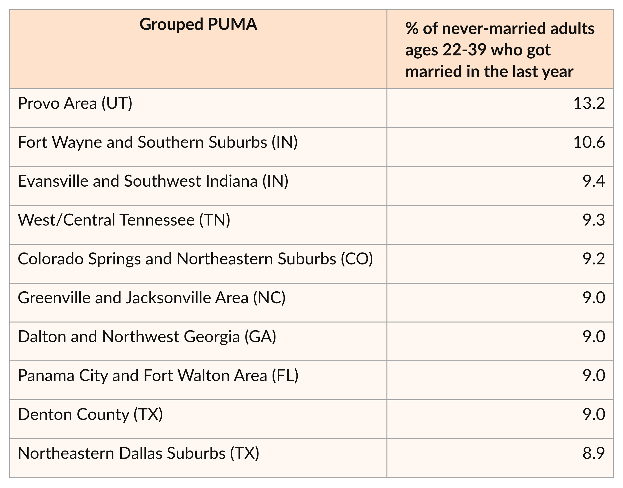
Marriage rates for this age group are also relatively high within the suburbs of Pittsburgh, Nashville, Austin, and Denver. (It is possible that many of these recently-married individuals first met within urban areas, then moved to the suburbs after they got married. Therefore, the cities that these suburbs surround might also be promising locations for finding a spouse.)
Ten regions with the lowest marriage rates among adults ages 22-39
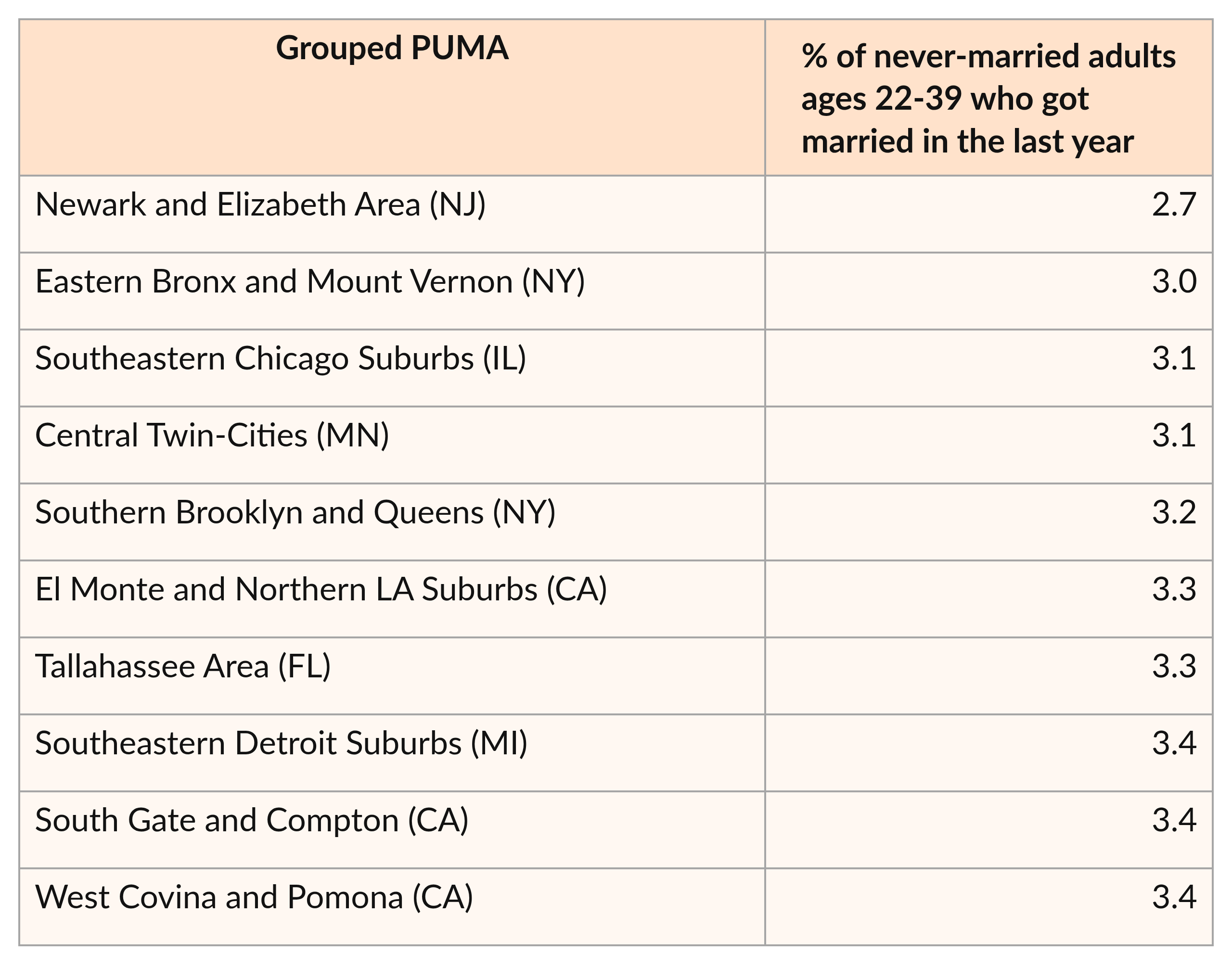
Marriage rates for this age group also tend to be lower within the Mississippi Delta, New Mexico, and southwestern Georgia.
Different trends emerge when we evaluate younger and older groups separately. For instance, the interior US tends to have higher marriage rates among adults ages 22-29 than do coastal cities.
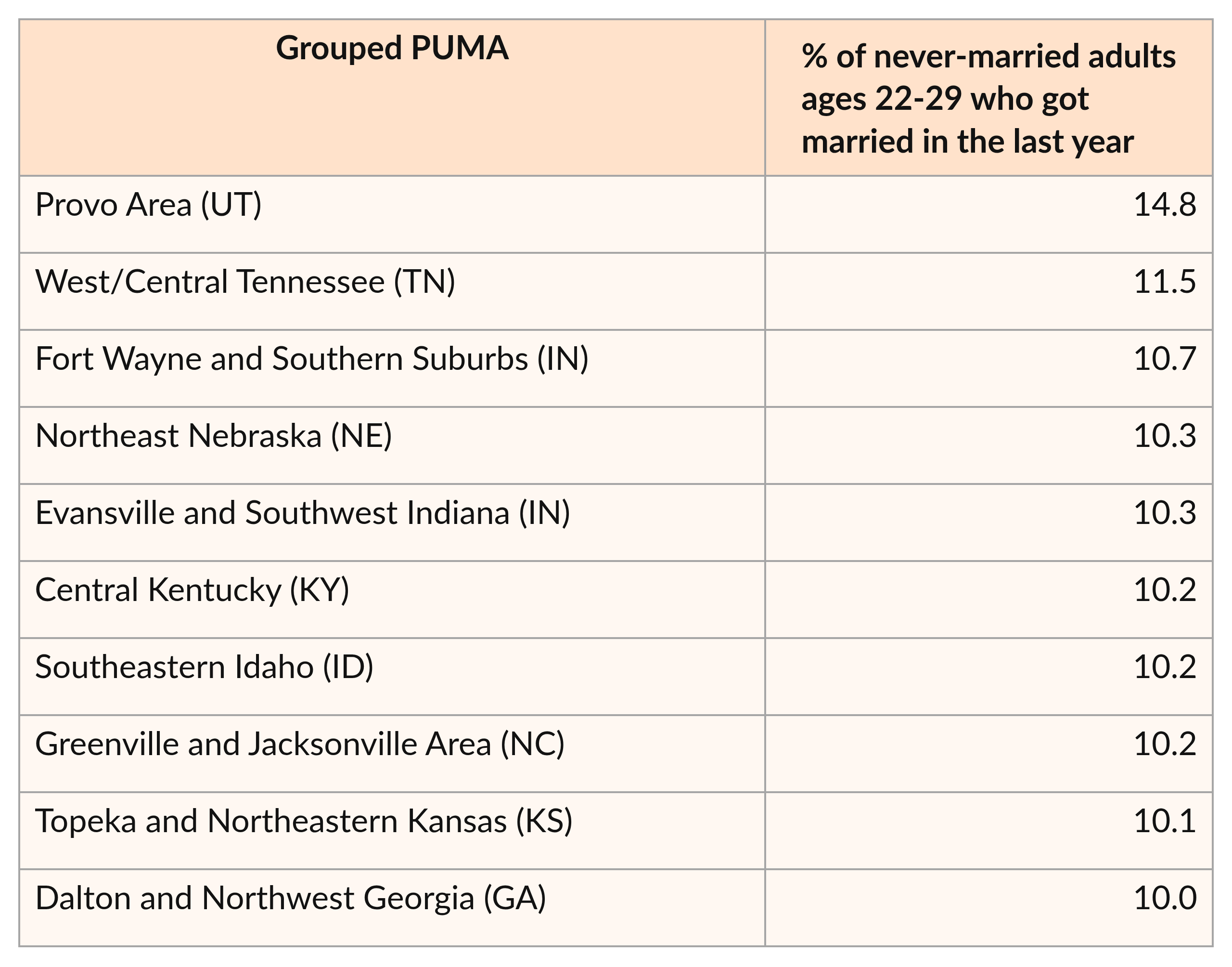
The top 10 areas for marriage rates among this younger age group are shown below. The Provo, Utah, region remains the highest-ranking area; in addition, four of the regions between Panama City and Fort Wayne in the previous table are present here as well. This list also includes parts of Nebraska, Idaho, and Kansas.
Ten regions with the highest marriage rates among adults ages 22-29
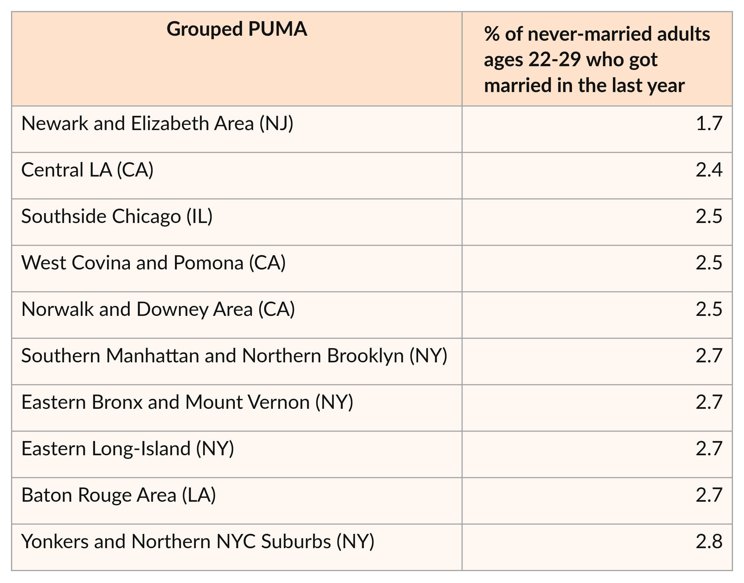
As shown in the table below, eight of the 10 regions with the lowest marriage rates among adults ages 22-29 are located in the Los Angeles and New York metropolitan areas. Although other parts of these metro areas have higher marriage rates for this age group, this finding suggests that those who desire to get married at a younger age might want to think carefully before moving to these regions.
Ten regions with the lowest marriage rates among adults ages 22-29
When we instead examine adults ages 30-39, we see notably different trends. The 10 regions with the highest marriage rates among adults in this age group, unlike those in the top 10 for adults ages 22-29, tend to be located near major cities; examples include San Jose, Los Angeles, New York, and Chicago. The fact that portions of the NYC, Chicago, and San Francisco metropolitan areas have lower marriage rates among the 22-29 age group suggests that many individuals in these cities prefer to wait until later to marry, perhaps as a result of cultural factors, or their high cost of living.
Only one region appears within both this top-10 list and the list for adults ages 22-29: the Fort Wayne/Southern Suburbs region of Indiana. While it is not at the very top of either list, its presence within both tables is still notable.
Ten regions with the highest marriage rates among adults ages 30-39
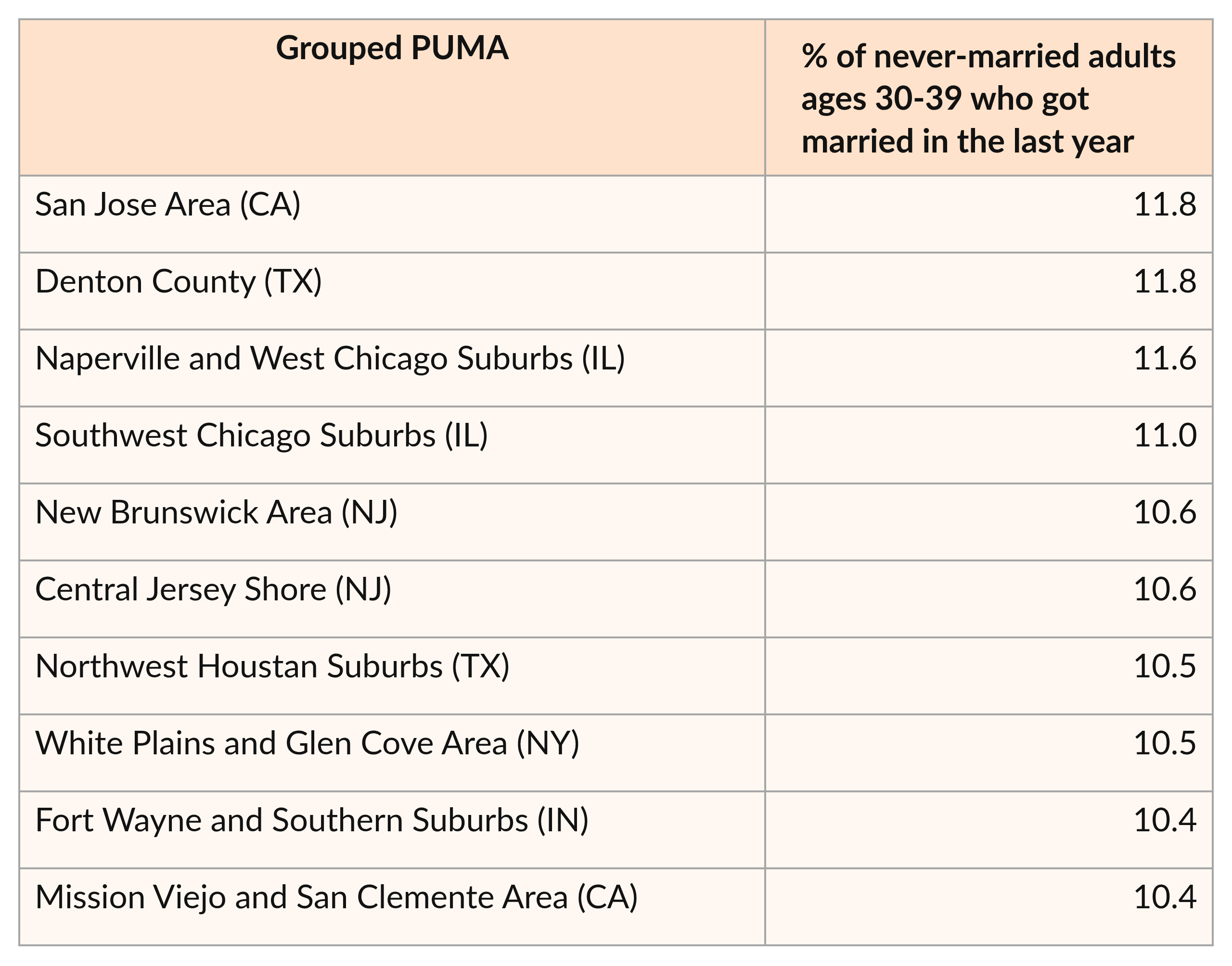
Although Colorado is not represented within this top-10 list, it is also a notable hotspot for marriage among thirty-somethings. The Austin, Nashville, Pittsburgh, and Boston areas also have high marriage rates among adults in this age group.
Many of the 10 regions with the lowest marriage rates for this age group, in contrast, tend to be located away from major cities. They include portions of the Southwestern U.S., the Mississippi Delta, western South Carolina, and western Pennsylvania. Parts of the DC, Chicago, and Phoenix metropolitan areas are present within this list as well.
Ten regions with the lowest marriage rates among adults ages 30-39
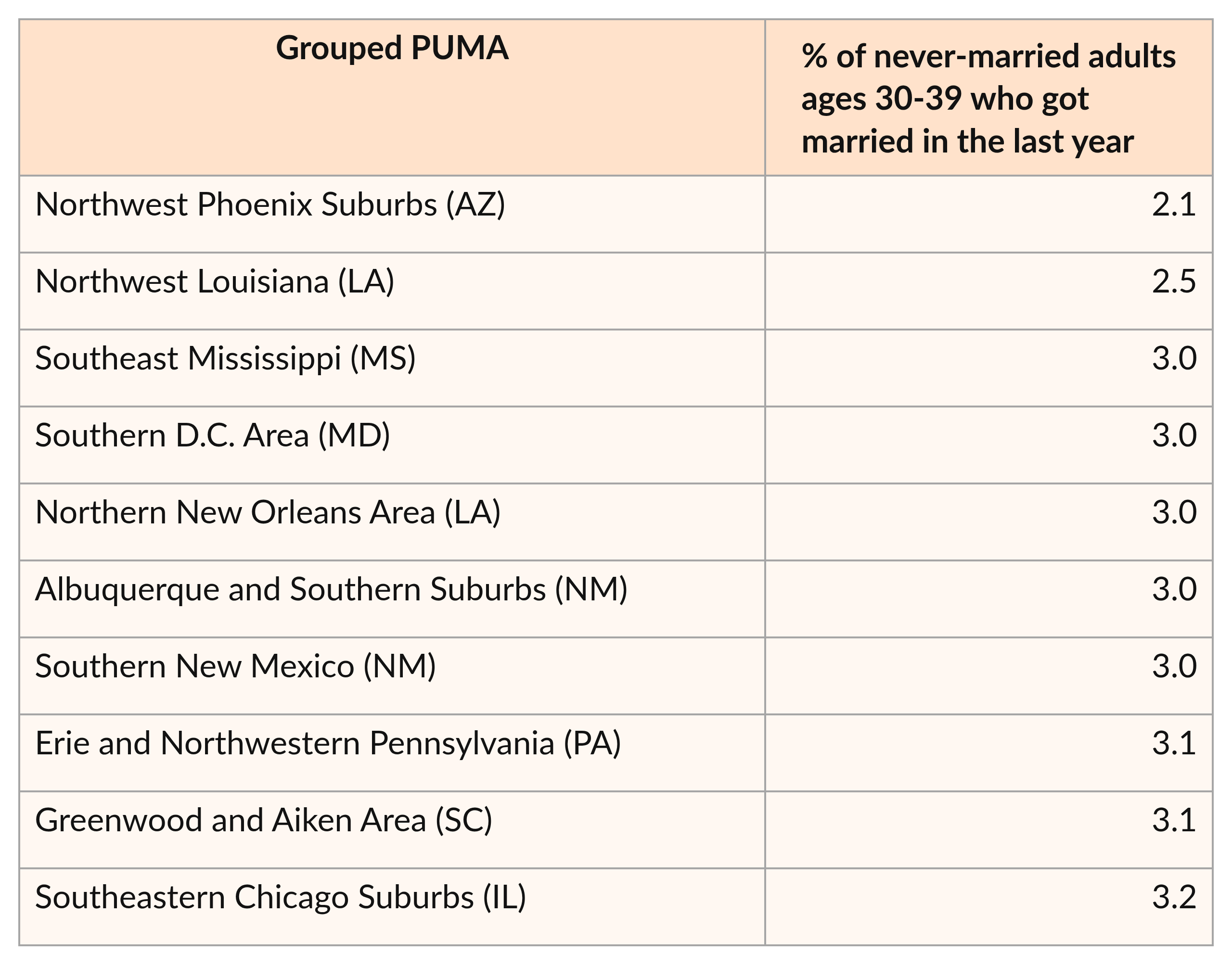
These findings demonstrate that, for young adults, the ‘best place’ to get married may depend largely on when they hope to marry. Those who are committed to marrying in their twenties may want to think carefully about moving to a major coastal city; meanwhile, those same cities could be an excellent option—though not the only choice—for marriage-minded adults in their thirties.
Which Metrics Correlate With Getting Married?
Marriage rates are the key focus of our Get Married Maps. However, few people will move to a region based on marriage odds alone. Therefore, we also explored additional variables of interest that are correlated with marriage rates.4
As shown in the following figure, a substantial positive correlation exists between marriage rates for each young-adult-female age group and the percentage of women in that age group who are married. Thus, while one might think that areas where more individuals are single are better places to find a spouse, the opposite is actually true.
However, areas with more single men relative to single women do indeed show higher female marriage rates. In addition, the ratio of single, full-time-employed men to all single women is an even better predictor of getting married.
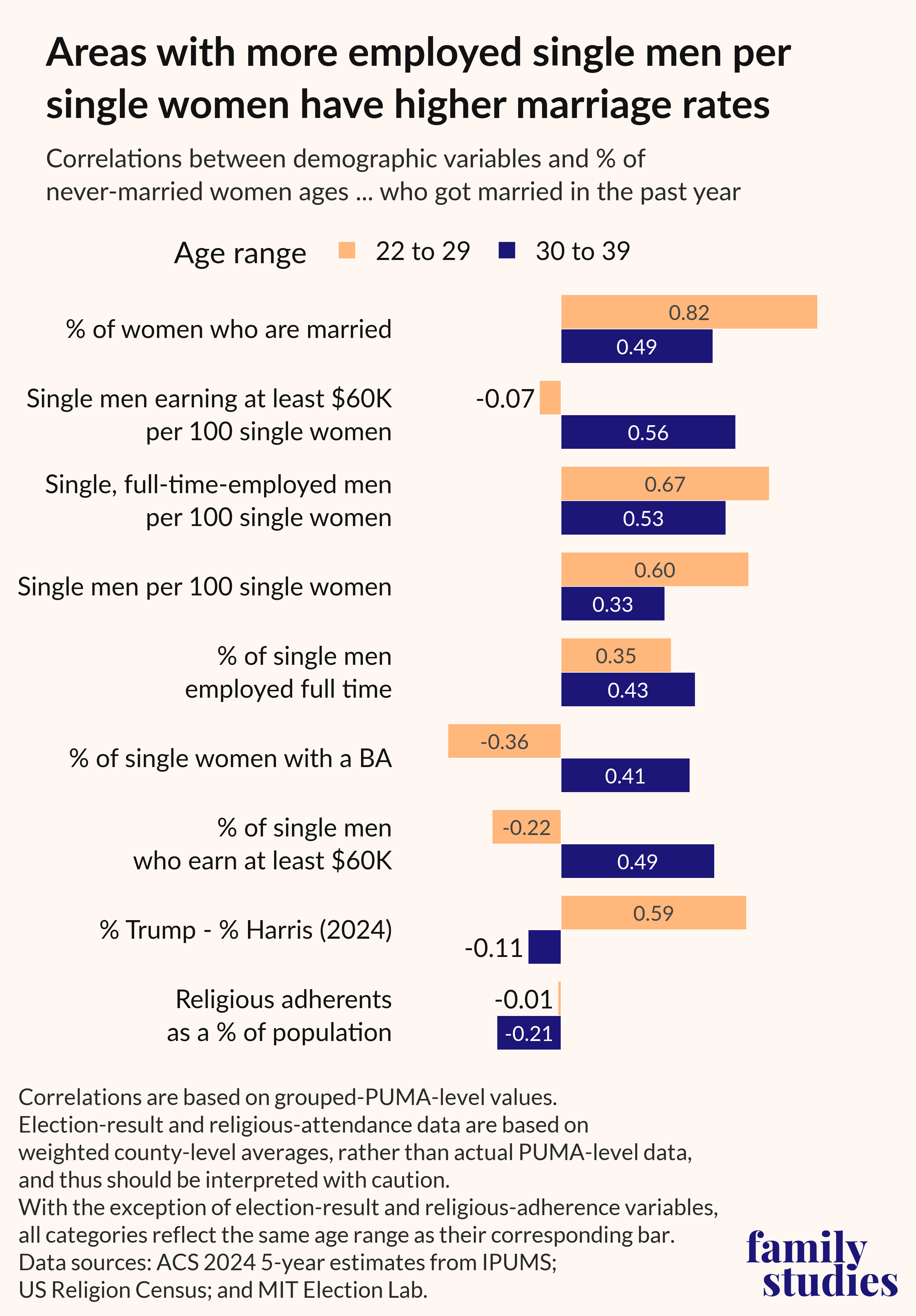
Figure 1. Correlations between demographic variables and percentage of never-married women who got married in the past year, by age
Given our findings for women, it is not surprising that we observe a strong positive relationship between the percentage of men who are married and male marriage rates. In addition, there is a notable connection between men’s marriage rates and the ratio of single, full-time-employed men to single women.
Interestingly, though, regions in which a higher share of single men have a bachelor’s degree or earn at least $60,000 have higher marriage rates for men in their thirties—but not for men ages 22-29. (This does not mean, however, that a college education or higher income is a hindrance to marriage for younger men; this will be discussed in further detail later in this brief.)
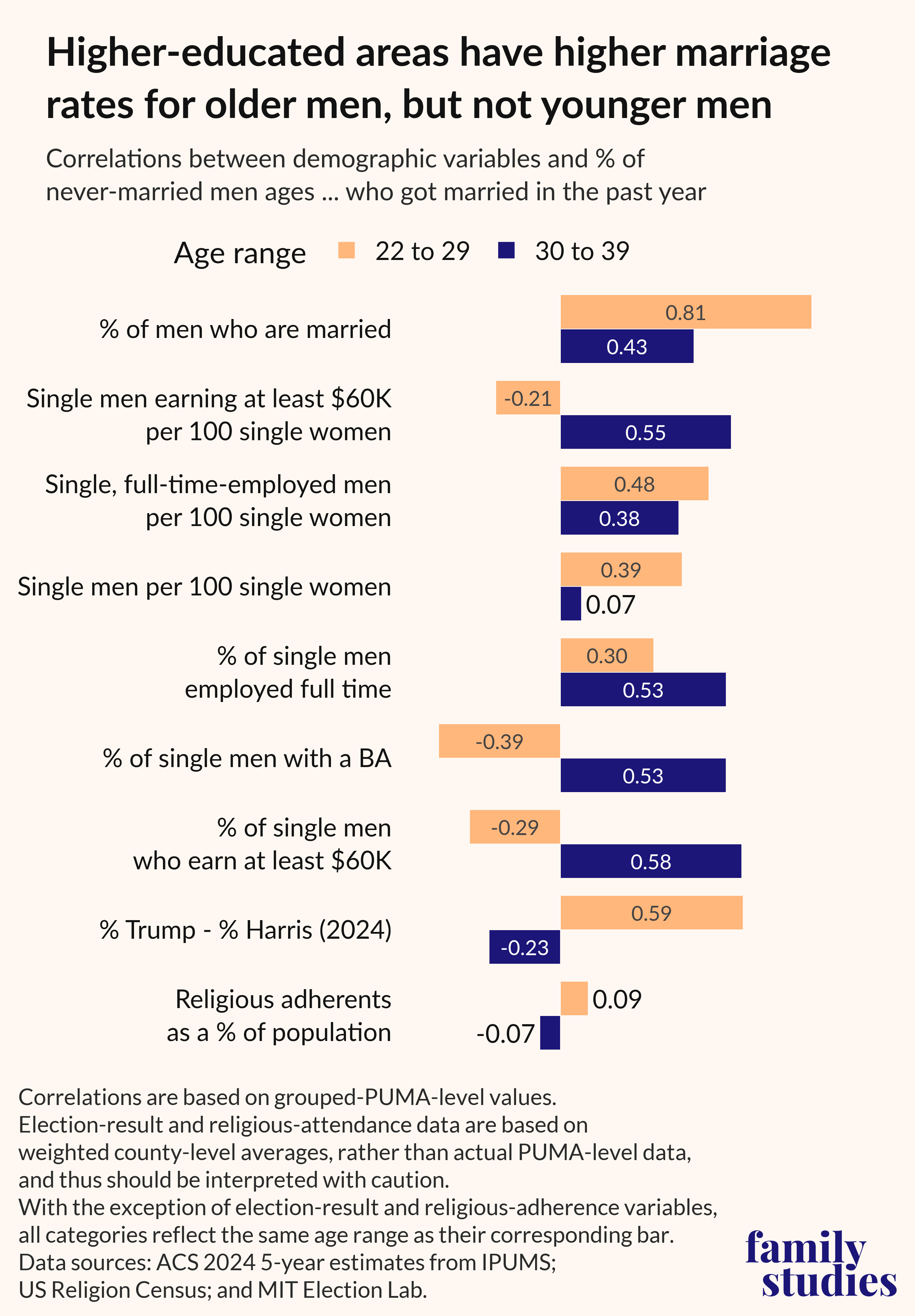
Figure 2. Correlations between demographic variables and percentage of never-married men who got married in the past year, by age
Availability of employed single men helps predict marriage rates
Among women ages 22-39, the ratio of single, full-time-employed men to all single women has a strong connection with marriage rates.5 (See the following interactive scatter plot for a visualization of this relationship by grouped PUMA.) This ratio is also predictive, to a lesser extent, of marriage rates for men.
Figure 3. Marriage rates for women by ratio of single, full-time employed men per 100 single women (among adults ages 22-39)
Many of the regions with the highest score for this metric are located in areas with a large military presence, including, Minot, ND; Fayetteville and Jacksonville, NC; Oceanside/Camp Pendleton, CA; El Paso Teller (near Colorado Springs, CO); and the Peninsula Region/JBLM (WA). However, Mountain View and Sunnyvale, CA also have notably high ratios of single, full-time employed men to single women, likely due, in part, to the large presence of major tech companies in that area.
Ten regions with the highest ratio of single, full-time-employed men per 100 single women
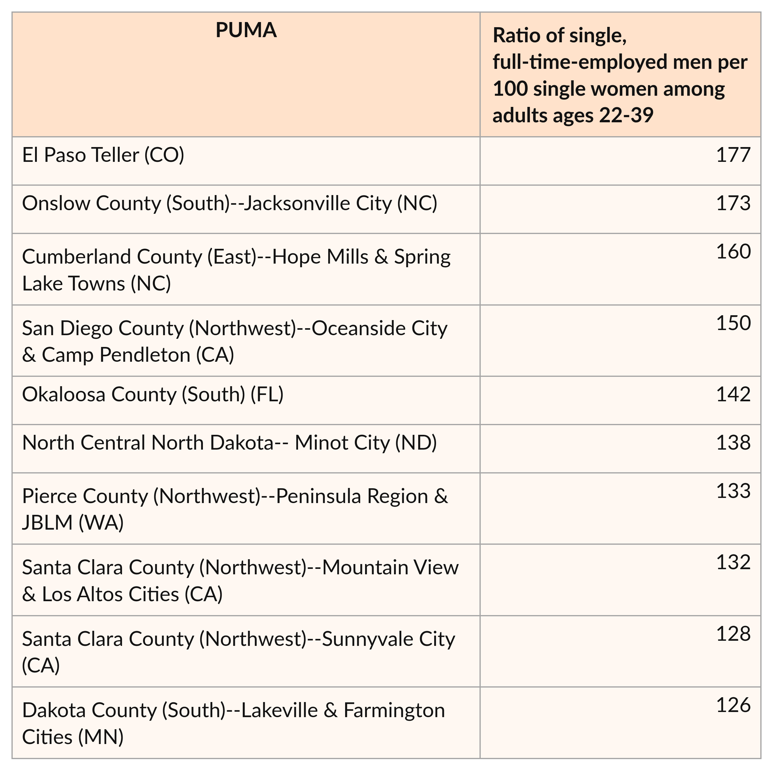
Parts of Northern Virginia also have relatively high ratios for this category, as do the Upper Midwest and Mountain West. Portions of Seattle and San Francisco perform strongly on this metric as well.
The 10 areas with the lowest ratios, in contrast, are mostly found within Midwestern cities, the Bronx, and the South. The Fresno and Baltimore metropolitan areas each appear within this bottom-10 list as well.
Ten regions with the lowest ratio of single, full-time-employed men per 100 single women
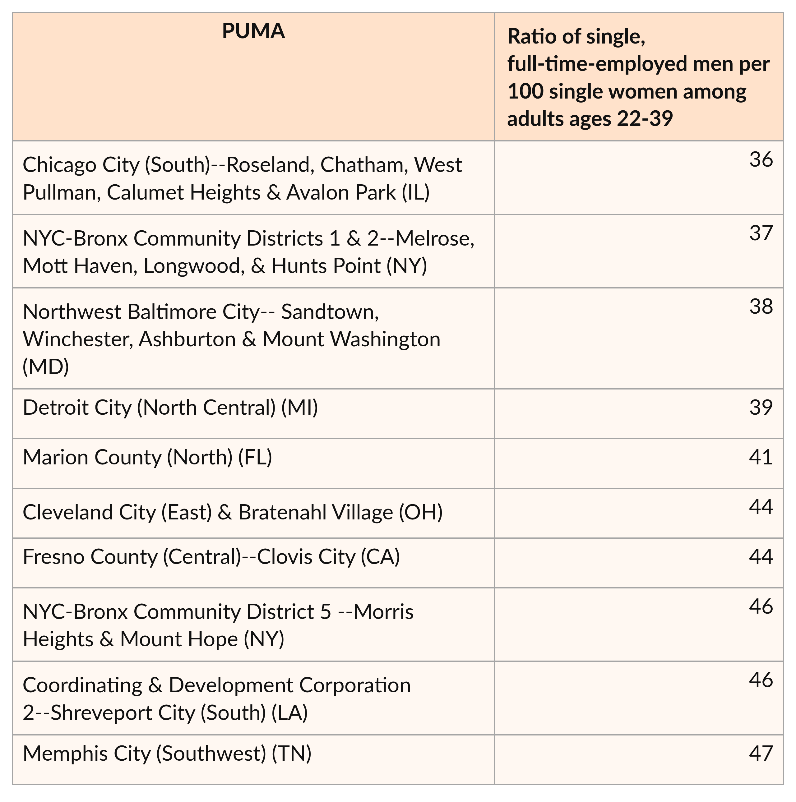 Outside these top-10 areas, we also see lower ratios in much of Mississippi and Alabama, portions of the NYC area, and southern Virginia.
Women’s marriage rates and the availability of higher-earning single men
In the Good Jobs, Strong Families report by Grant Martsolf and Brad Wilcox, a ‘good wage’ was defined as an income greater than $60,000. Therefore, this salary serves as a good benchmark for our own income analyses. It is, however, a relatively high bar for singles within our age range. Using American Community Survey 5-year microdata from IPUMS, we found that only 32% of single men ages 30-39, and 19% of single men ages 22-29, have personal incomes of $60,000 or more. (The values for single women were slightly lower: 27% of those ages 30-39, and 15% of those ages 22-29, earned at least this much.)
As part of our income analyses, we explored how women's marriage rates are correlated with the ratio of single men earning $60,000 or more to all single women. Interestingly, this relationship varied markedly by age group.
Among young adults in their thirties, the ratio of single men who earn at least $60,000 to all single women (regardless of income) has a strong positive correlation with the percentage of women who got married in the past year.
Figure 4. Marriage rates for women by ratio of single men earning at least $60,000 per 100 single women (among adults ages 30-39)
Seven of the top 10 regions for this ratio are located in Seattle, San Jose, and San Francisco—all major tech hubs with plenty of highly-paid employees. The remaining three are located in either the New York or Washington, DC, metropolitan areas.
Ten regions with the highest ratio of single men earning at least $60,000 per 100 single women
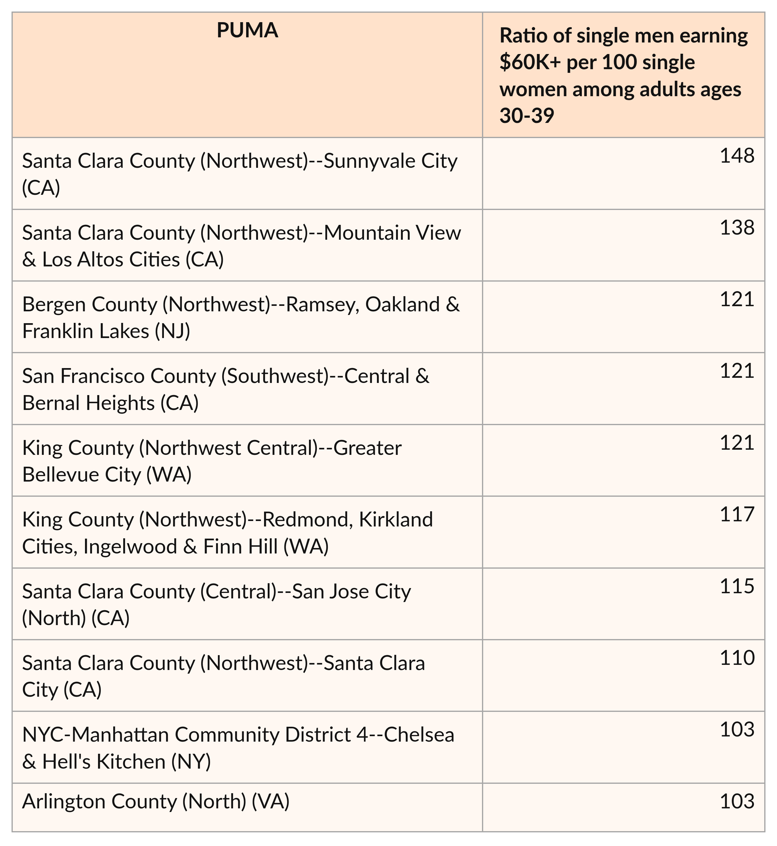
On a national scale, we also see particularly high values within the Washington-Boston corridor, as well as Austin, Minneapolis, and much of the state of Colorado. Thus, tech hubs are not the only regions with high ratios of higher-earning single men to single women.
Meanwhile, the 10 regions with the lowest ratios tend to be located in more rural areas of the Southeast and Appalachia. Similarly, outside of major metropolitan areas like Atlanta and Raleigh, the Southeastern U.S. tends to have relatively low ratios for this metric.
Ten regions with the lowest ratio of single men earning at least $60,000 per 100 single women
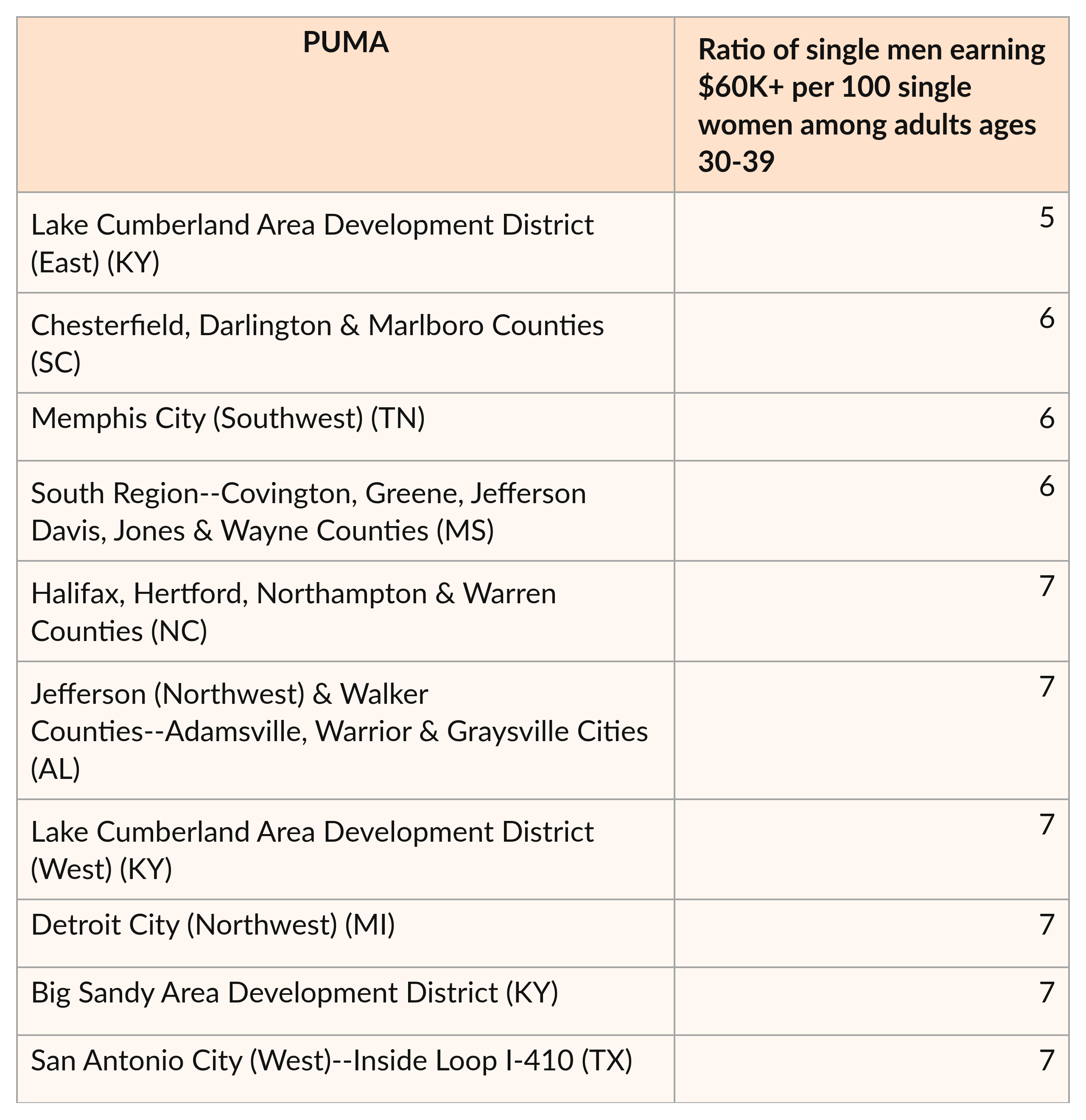
However, when we instead analyze this relationship for the 22-29 age category, we find essentially no association at all between the two variables. In other words, the relative availability of higher-earning men has a strong connection to marriage rates for women in their thirties, but not for this younger group.
Figure 5. Marriage rates for women by ratio of single men earning at least $60,000 per 100 single women (among adults ages 22-29)
A similar pattern is found for the percentage of single men who earn $60,000 or more: this variable has a positive correlation with marriage rates for women in their thirties, but not for women ages 22-29.
What could explain this difference? One possibility is that women who marry younger men might see future earning potential in them that has not yet materialized. (For instance, our income calculations did not exclude students; men in law or medical school may earn little or no money in their early twenties but higher salaries later on.)
Alternatively, it is possible that, for those who marry in their twenties, financial concerns are not as important as they are for those who wait until their thirties to marry. Finally, areas with higher rates of marriage among younger women may have lower costs of living; in this case, lower salaries might be less of an issue.
For men, regional relationship between education and marriage is also age dependent
Similarly, the connection between education and marriage differs significantly among younger and older single men. At a regional level, the percentage of single men in their thirties with a bachelor’s degree has a notable positive correlation with the percentage of men in that same age group who got married in the past year.
Figure 6. Marriage rates for men by percentage of single men who have a bachelor’s degree (among men ages 30-39)
However, among single men ages 22-29, the percentage of men with BAs has a much smaller, and negative, correlation with marriage rates. This may be because men with a bachelor's degree are more likely to live in large cities than those without one. (As discussed earlier, urban regions have higher marriage rates among adults in their thirties, but lower rates among adults in their twenties).
Figure 7. Marriage rates for men by percentage of single men who have a bachelor’s degree (among men ages 22-29)
It’s worth clarifying, however, that within each age group, marriage rates for men who have a bachelor’s degree are indeed higher than those for men who don’t. (The same is true for women, as the following figure shows.) Even so, for both sexes, the gaps in marriage rates by education level are narrower for those in their twenties.
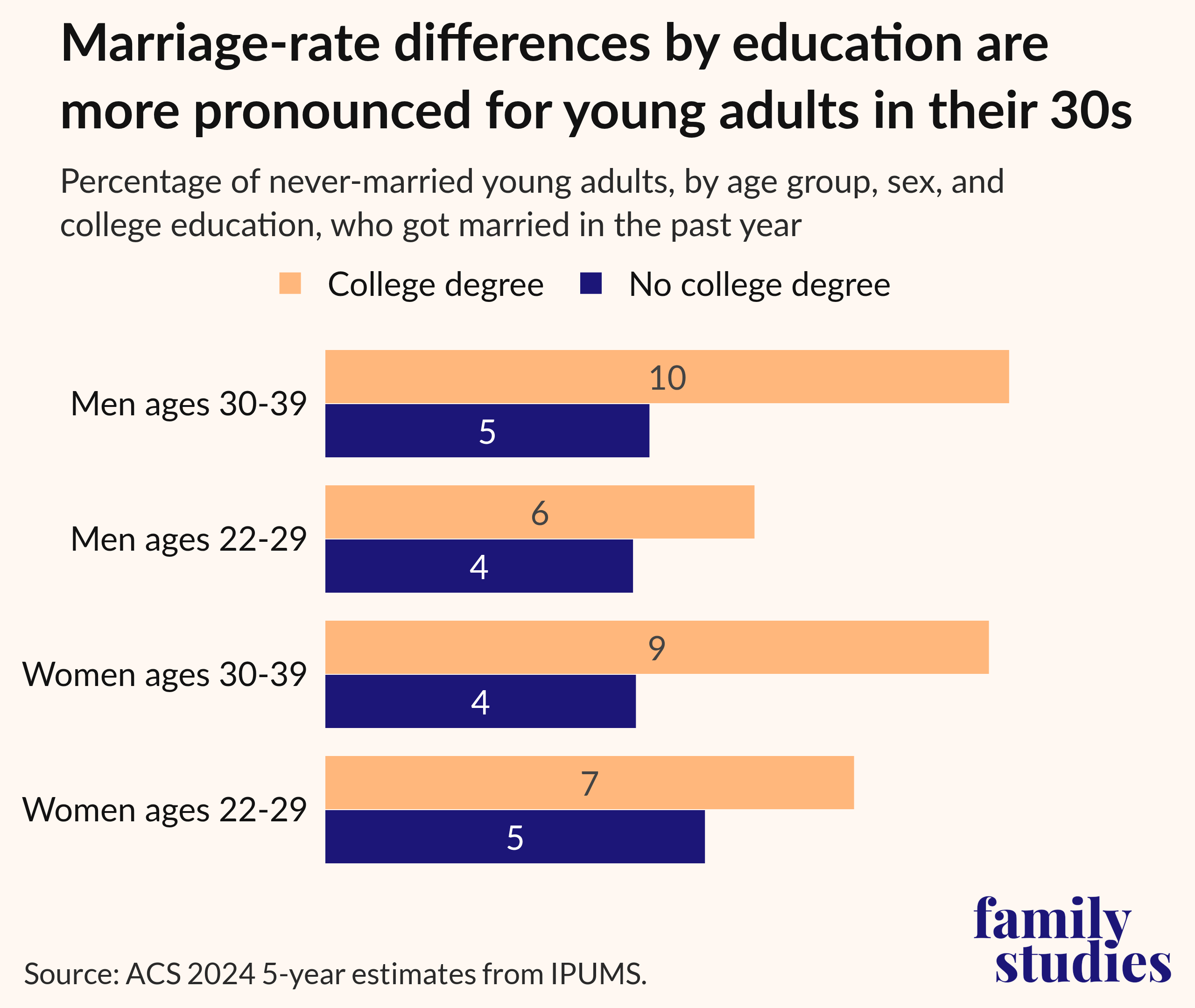
Figure 8. Percentage of never-married young adults, by age group, sex, and college education, who got married in the past year
Regional relationship between higher incomes and marriage differs by age for men
We also see diverging patterns for the relationship between young men’s incomes and their marriage rates. As shown below, regions in which higher shares of single men in their thirties earn at least $60,000 also have higher male marriage rates for that age group.
Figure 9. Marriage rates for men by percentage of single men who earn at least $60,000 (among men ages 30-39)
However, the opposite is true for younger men: regions where higher shares of men ages 22-29 earn $60,000 or more have lower marriage rates. The nature of urban areas could help explain this relationship, as cities tend to have both a greater share of higher-paying jobs and lower rates of marriage among adults in their twenties.
Figure 10. Marriage rates for men by percentage of single men who earn at least $60,000 (among men ages 22-29)
This does not mean, however, that higher-earning men in their twenties are less likely to marry. In fact, men ages 22-29 who earn at least $60,000 are around twice as likely to get married in a given year as those who do not. (Higher-earning women are also more likely to marry, as recent IFS research demonstrated.)
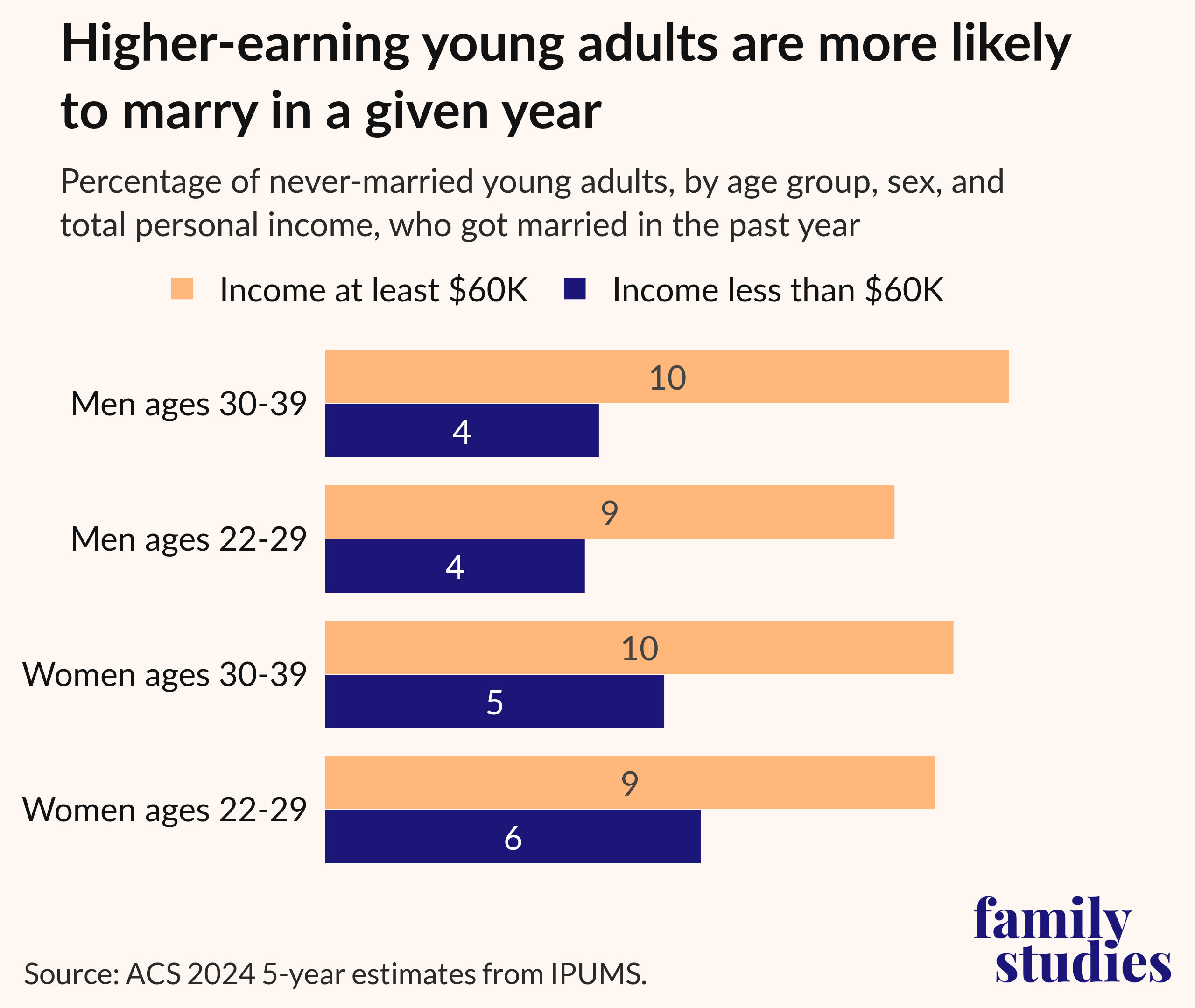
Figure 11. Percentage of never-married young adults, by age, sex, and total personal income, who got married in the past year
The implication of these findings for men in their twenties is that while higher incomes and marriage are certainly linked, moving to a region with lots of higher-earning young men will not necessarily result in better odds of marriage.
Religion, Ideology, and Marriage Rates
The relationship between our regional estimates6 of Trump’s performance relative to Harris in 2024 and marriage rates is also age dependent. These two variables have a positive and relatively strong correlation for men and women ages 22-29; however, for thirty-something adults of each sex, this relationship is much weaker and negatively correlated. One possible explanation is that more rural parts of the country, where Trump generally performed better than Harris, often have higher marriage rates for adults in their twenties.
Meanwhile, we initially expected to see a positive regional correlation between religious affiliation and the percentage of young adults who got married in the past year. After all, as General Social Survey7 data shows, religious individuals in their twenties and thirties are significantly more likely than their nominal and secular counterparts to be married.
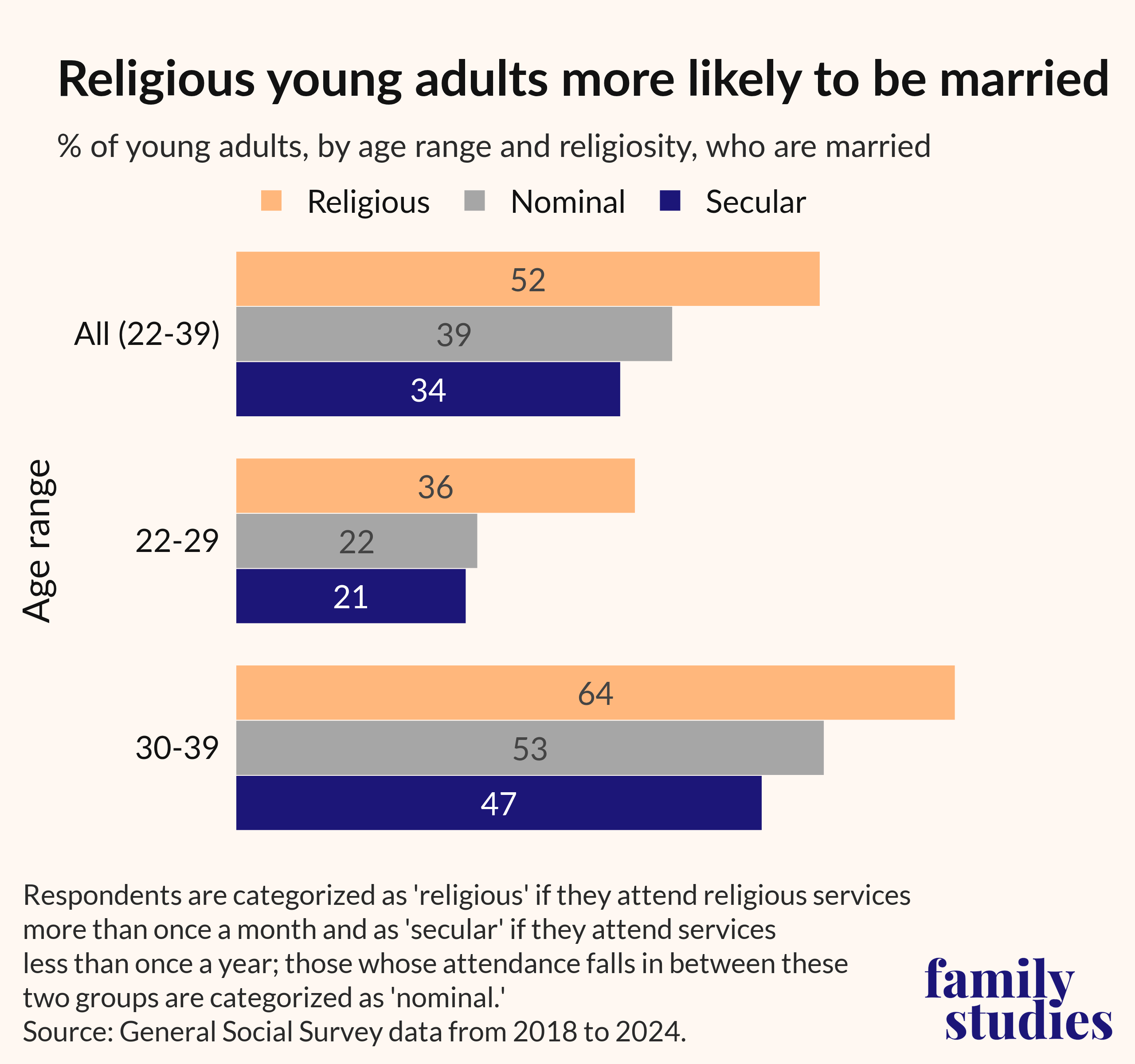
Figure 12. Percentage of young adults, by age range and religiosity, who are married
Surprisingly, however, we find essentially no regional relationship between religious-adherent shares and the percentage of young adults who got married in the past year. Certain parts of the country (e.g., areas of Utah) do indeed have both high rates of religious affiliation and high marriage rates. However, there are also plenty of regions (such as those in the Southeast) with higher religious affiliation but lower young-adult marriage rates. Similarly, parts of the Northwest and Mountain West have both higher marriage rates and lower religious affiliation. Thus, on a national scale, we find essentially no connection between these two variables. (Similarly, we did not find a relationship between religious adherence and the percentage of young adults who are married.)
Figure 13. Marriage rates among adults ages 22-39 by religious adherence
There are several possible explanations for this finding. First, our religious-adherent data does not differentiate by age; it is possible that, if we looked only at the percentage of young adults who belong to a religious congregation, we might have found more significant results for this metric. Second, our grouped-PUMA religious-adherent percentages are weighted averages of county-level data rather than actual grouped-PUMA-level values. If we had access to actual PUMA-level religious-adherent data, we might find a stronger connection between religiosity and marriage.
Conclusion
Determining where to move after high school or college is no easy task. Many of the most important factors involved—such as proximity to family, where one receives his or her first job offer, and the desire to explore a new part of the country—cannot be displayed within a mapping project like this one. In addition, we acknowledge the important role that employment rates, job opportunities, cost of living, and cultural factors all play in deciding where to relocate.
However, we encourage those who wish to get married in the future to pay attention to our marriage-rate findings. If one appealing area has twice the marriage rate as another, it may indeed be the better option for a marriage-minded young adult. Similarly, young adults hoping to marry in their twenties might want to avoid moving to a coastal metropolitan area where such a decision is less common. While marriage rates are not the only factor to consider, they are certainly just as important, if not more important, than many of the other criteria often used for popular city rankings. We hope that these maps will bring more attention to this underappreciated metric.
It’s very possible that the marriage rates shown within this map will change in coming years. This decade’s top regions for getting married may end up underperforming other areas in the future. For that reason, we plan to continue updating these maps as new demographic data becomes available. That way, the maps can continue to inform relocation decisions for individuals who wish to not only find a job and a friend group in a new city, but a spouse as well.
Editor's Note: For the Appendix, download the full report below.
Endnotes
- Citation for IPUMS USA Data: Steven Ruggles, Sarah Flood, Matthew Sobek, Daniel Backman, Grace Cooper, Julia A. Rivera Drew, Stephanie Richards, Renae Rodgers, Jonathan Schroeder, and Kari C.W. Williams. IPUMS USA: Version 16.0 [dataset]. Minneapolis, MN: IPUMS, 2025.
- One limitation of our data is that we do not know exactly where adults were living at the time that they got married. Instead, our analyses are based on (1) where adults are currently living, and (2) whether or not those adults got married in the past year. This means that, if a couple got married in a city but then immediately moved out to a suburban town, that marriage would increase the suburb's marriage rate within our maps rather than the city's. Similarly, many couples—particularly those in longer relationships—may have met each other in one region but gotten married in another.
Our decision to examine who got married in the previous year, rather than the last 3 years, 5 years, etc., should help reduce the percentage of respondents who moved between getting married and taking the American Community Survey. Nonetheless, due to this factor (along with sampling error), these maps are an approximation, rather than a perfect image, of each region’s actual marriage rates.
In an attempt to mitigate this issue, we did explore alternative approaches to calculating these marriage rates. One option would have been to exclude respondents whose migration PUMA changed over the past year from our marriage-rate analyses. However, this would not only reduce our sample size (and thus widen our confidence intervals), but also exclude any respondents who changed PUMAs in order to move closer to the individual they were about to marry.
The San Jose Area grouped PUMA provides one possible example of individuals moving for marriage: 14.2% of never-married women ages 30-39 in San Jose got married in the past year; however, when we exclude women who changed migration PUMAs during that time, this value drops to 10.9%. One plausible explanation for this difference is that the former percentage includes a number of women who moved to San Jose to live with their new husbands who work in the technology sector there. (The corresponding values for men ages 30-39 were much closer: 10.6% and 9.9%, respectively. This suggests that couples aren’t simply choosing to move to San Jose as a post-marriage destination.)
Therefore, we ultimately chose not to exclude recent movers, as doing so could exclude individuals who moved to get married—and would thus undermine the main purpose of our maps, which is to show the best places to move in order to find a spouse.
In addition, we could have only included individuals in our calculations who did not move in the past year or whose past migration PUMA mapped only to a single PUMA. We could then have based marriage-rate calculations on the PUMA in which these individuals lived during the previous year. However, since many individuals change their residences at the time they get married, this approach would exclude a significant portion of respondents from our dataset.
Finally, we could have simply calculated marriage rates by respondents’ migration PUMA during the previous year, as this PUMA can be determined for all ACS respondents. However, this would have resulted in a loss of detail within highly-populated counties (such as Los Angeles County), as migration PUMAs, unlike regular PUMAs, cannot include only a portion of a given county.
To determine the effect of these alternative approaches on our overall findings, we compared them, via correlation analyses, for each of the nine age/sex groups featured in our maps (women ages 22-29, both sexes ages 22-39, etc.). We found that the grouped-PUMA-level correlations between our standard marriage rates and those based on individuals’ previous locations ranged from 0.862 (for men ages 22-39) to 0.930 (for adults ages 30-39). The correlations between our standard rates and those that filtered out recent movers were even higher, ranging from 0.957 (for men ages 22-39) to 0.969 (for adults ages 30-39). Finally, marriage-rate analyses based on respondents’ migration PUMA during the previous year also correlated strongly with those based on respondents’ current migration PUMAs; the exact coefficients ranged from 0.851 (for men ages 22-29) to 0.930 (for adults ages 30-39).
Given the high correlations we observed between these various methods, we can conclude that the alternative approaches would not have had a major effect on our overall findings. - The names of grouped PUMAs within these tables have been condensed in order to make them more intuitive. As a result, they do not match their corresponding grouped-PUMA names within the corresponding tables of the Get Married Maps site.
- These analyses were based on linear regressions of grouped-PUMA data, as marriage-rate data at the individual-PUMA level contains a large amount of statistical noise.
- Male and female marriage rates for the age groups we evaluated will usually differ within each grouped PUMA. This can occur for several different reasons. First, different grouped PUMAs will have different numbers of never-married single men and women (the denominator for our marriage-rate calculations), which will cause marriage rates to differ for those areas. Second, if an individual outside the age range we used for our analysis, such as a man in his forties, marries someone within our age range, such as a woman in her thirties, this marriage will only contribute towards the listed marriage rates or one sex. The average grouped-PUMA-level marriage rate for women ages 22-39 was 6.6, a decent amount higher than the average for men (5.5).
- Because our election-result data, as well as our religious-adherent data, was originally provided at the county level, we needed to convert it into estimated PUMA-level data (using an approach explained in the methodology section) before we could incorporate it into a correlation analysis at the grouped-PUMA level. This approach has some significant limitations, particularly for PUMAs that only make up part of a highly-populated county. Thus, these results should be interpreted with caution.
- Citation for General Social Survey data: Davern, Michael; Bautista, Rene; Freese, Jeremy; Herd, Pamela; and Morgan, Stephen L.; General Social Survey 1972-2024. [Machine-readable data file]. Principal Investigator, Michael Davern; Co-Principal Investigators, Rene Bautista, Jeremy Freese, Pamela Herd, and Stephen L. Morgan. Sponsored by National Science Foundation. NORC ed. Chicago: NORC, 2025: NORC at the University of Chicago [producer and distributor]. Data accessed from the GSS Data Explorer website at gssdataexplorer.norc.org.
- These percentages were created by dividing the total number of members of congregations in a given region by that region's population. This means that, if many congregants travel to a given congregation from nearby regions, the listed percentage may actually exceed 100%. This occurs in around 30 counties and county equivalents.
- Citation for the 2020 US Religion Census: Clifford Grammich, Erica Dollhopf, Mary Gautier, Richard Houseal, Dale E. Jones, Alexei Krindatch, Richie Stanley, and Scott Thumma. 2023. 2020 U.S. Religion Census: Religious Congregations & Membership Study. Association of Statisticians of American Religious Bodies.
- Citation for MIT Election Lab data: MIT Election Data and Science Lab, 2018, "County Presidential Election Returns 2000-2024," at Harvard Dataverse, V20.